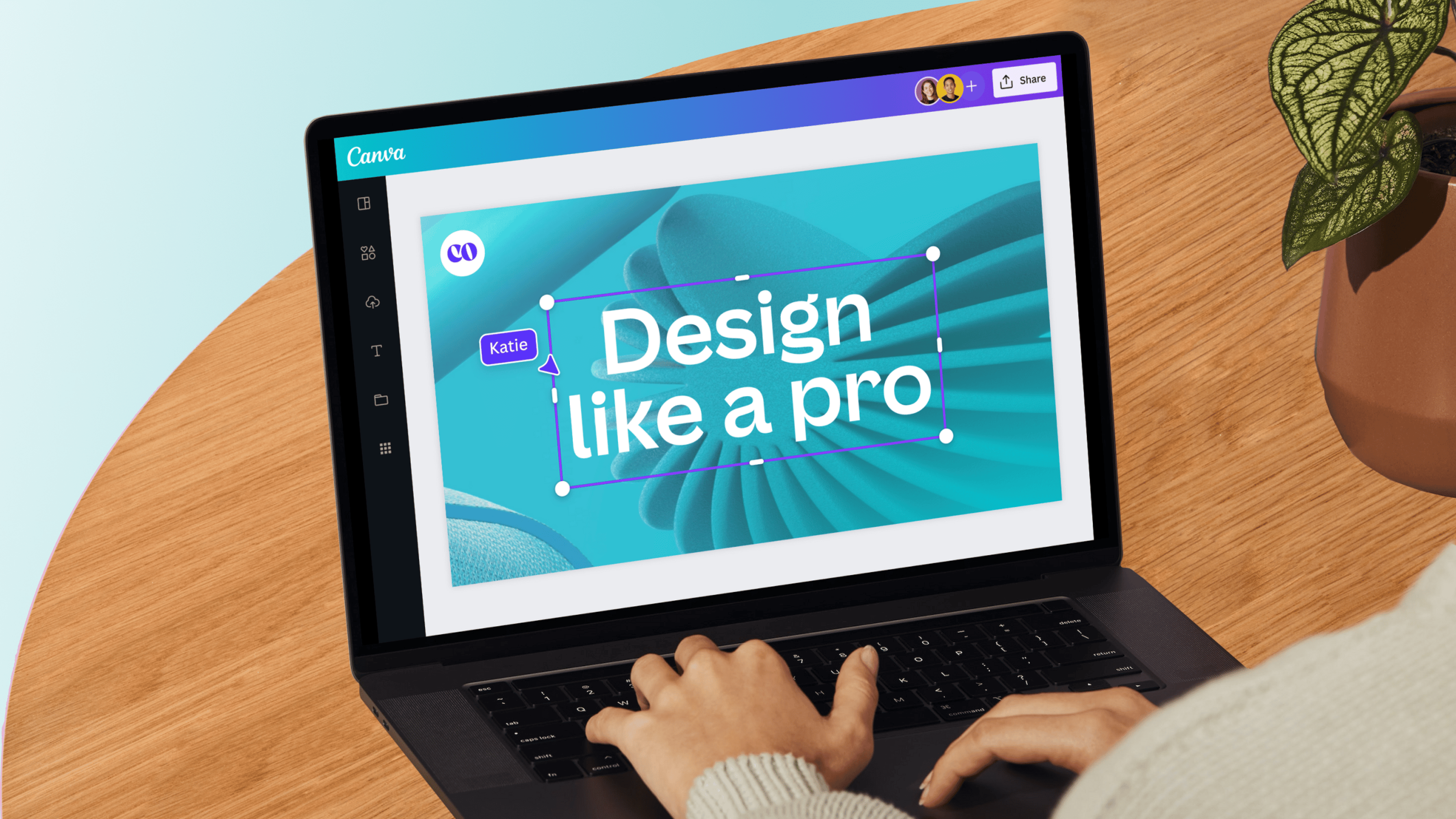
In today’s competitive digital landscape, your website is often the first point of contact for potential customers. It’s not enough to have a visually appealing site — your website should be designed with conversions in mind. A well-optimized website can turn visitors into loyal customers. In this article, we’ll share expert tips on how to design a website like a pro to boost your conversions, with insights from NetSoft.
1. Keep Your Design Clean and Simple
A cluttered website can overwhelm visitors and cause them to leave without taking action. Focus on simplicity in your design by using plenty of white space, clear fonts, and a minimalistic layout. This not only makes your website more visually appealing but also improves the user experience, making it easier for visitors to navigate and find what they need.
2. Optimize for Mobile Devices
With the growing number of users accessing websites via smartphones and tablets, mobile optimization is crucial. A mobile-responsive design ensures that your website looks great and functions smoothly across all devices. This is essential for reducing bounce rates and increasing conversion opportunities, as mobile users are more likely to convert when the site is easy to navigate.
3. Prioritize Fast Loading Times
Website speed is a major factor in user experience and conversions. If your website takes more than a few seconds to load, visitors may leave before even viewing your content. To optimize loading times, use optimized images, enable browser caching, and reduce unnecessary plugins or scripts. A faster website leads to higher user engagement and better conversion rates.
4. Use Clear Calls to Action (CTAs)
Effective calls to action guide visitors toward taking the desired action, whether it’s signing up for a newsletter, making a purchase, or contacting you for more information. Place your CTAs strategically throughout your website and make them stand out using contrasting colors, bold text, or buttons. Ensure that the messaging is clear and action-oriented (e.g., “Get Started,” “Contact Us Today”).
5. Leverage Visual Hierarchy
Organizing your content in a way that naturally guides users through the site is key to improving conversions. Use headings, subheadings, and bullet points to structure your content. Important elements, such as CTAs and key messages, should be prominently displayed to capture attention. Visual hierarchy helps visitors focus on what’s important and encourages them to take action.
6. Build Trust with Testimonials and Social Proof
Trust is a crucial element in converting website visitors. Including customer testimonials, reviews, and social proof (such as logos of well-known clients) can significantly boost credibility and encourage conversions. Display these elements prominently on your homepage or product pages to reassure potential customers that they’re making the right choice.
7. Incorporate High-Quality Images and Videos
Visual content can play a powerful role in conversion rates. High-quality images and videos capture attention and help explain your products or services more effectively than text alone. A professional and cohesive visual presentation can enhance the user experience and make visitors more likely to convert.
8. Use A/B Testing to Optimize Your Design
A/B testing involves experimenting with different versions of your website design to determine which elements lead to higher conversion rates. Test different CTAs, landing pages, headlines, and layout options to find the most effective combinations. Continuous testing and optimization ensure that your website is always performing at its best.
9. Ensure Clear Navigation
If visitors can’t find what they’re looking for, they’re unlikely to convert. Simple, intuitive navigation helps users explore your site and discover key information with ease. Use clear labels, organized menus, and breadcrumbs to guide visitors throughout the site, reducing friction and improving user satisfaction.
10. Focus on User Experience (UX)
A well-designed website is centered around the user experience. Make sure your website is easy to navigate, loads quickly, and provides value to visitors. Understanding the pain points and needs of your target audience will allow you to create a seamless UX that encourages users to take action.
We offer transparent pricing and work closely with you to ensure that you get the best value for your investment. Our web design services cover everything from custom designs to ongoing maintenance, ensuring your website performs optimally.
Ready to explore website design or redesign in Dubai? Contact NetSoft at +971 50 2194018 to discuss your project and receive a custom quote today!

